I actually sat down tonight with the idea that I would edit this collection a little, finesse the curation before writing this post. But then I enjoyed looking through these images so much that I thought “screw it”. I saved all these images because I like them and that in itself is the curation.
But I digress, as usual.
My husband and I were recently in a bottle shop selecting a wine to take to my parents’ house for dinner. I kept getting distracted by all the wine label designs which I hadn’t really looked at in a long while and I thought a wine label round up would be perfect for a Substack post. I figured hanging out in the bottle shop taking photos of the stock would probably draw the ire of the staff, so onto Google I hopped when I got home.
Can. Of. Worms.
There are so many great wine labels out there. And by “great”, I mean interesting, attractive, intriguing, entertaining, mood-setting labels.
I’m not a wine connoisseur. Most people aren’t. I just know if I like the taste of something or not, and I suspect my palate is not terribly sophisticated. So I can take a guess from the tasting notes whether I’m going to enjoy the contents of the bottle, but the label? That’s something I can enjoy right now and it turns a bottle of wine into not just a beverage, but an experience. The label sets the tone. Is this an elegant, sophisticated drop or a bit of fun? Is it summer holiday or Parisian bistro?
It’s a bit like the design of a perfume bottle setting your expectations for the contents. The sad thing is, the wine is over far sooner than a perfume and then what do we do with these wonderful labels? (We haven’t figured that one out yet, but there is a slowly growing row of empties sitting along the sideboard in our lounge because we’re not yet ready to part with the labels).
Anyway, if you too select your wine by how pretty the label is, here are some for your consideration.
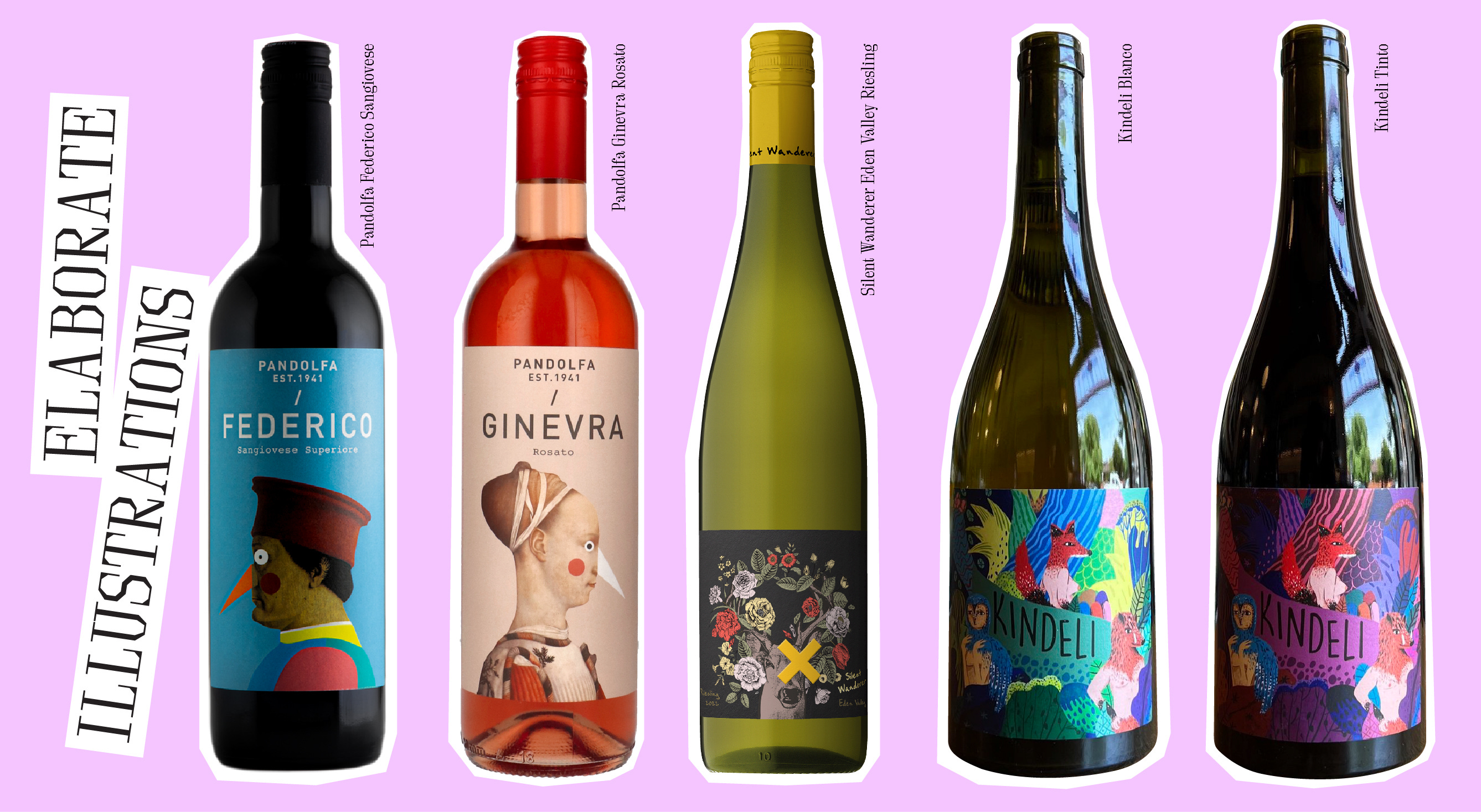
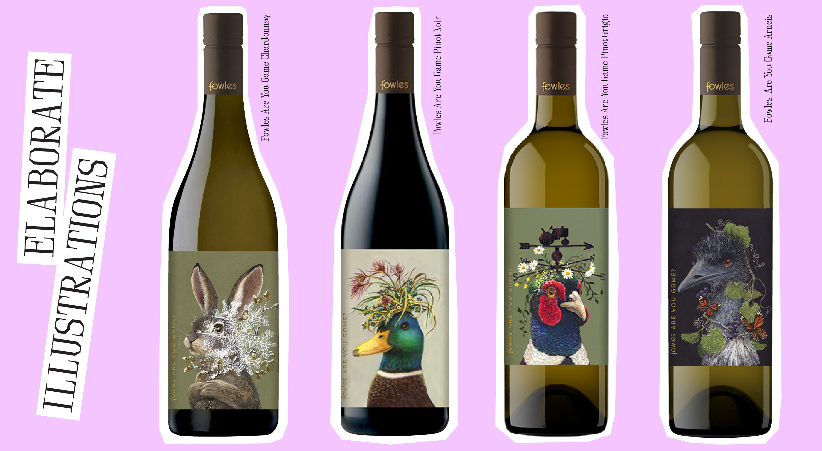
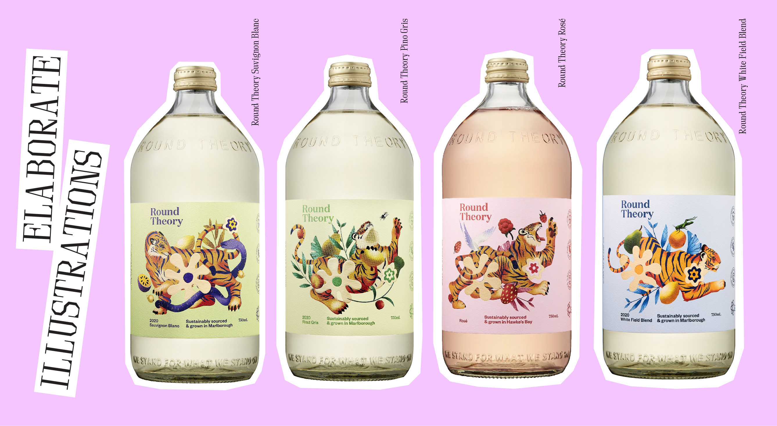
Elaborate Illustrations
I got pretty carried away with this category, there are so many fun, charming, and beautiful illustrated wine labels out there. Here are my stand outs:
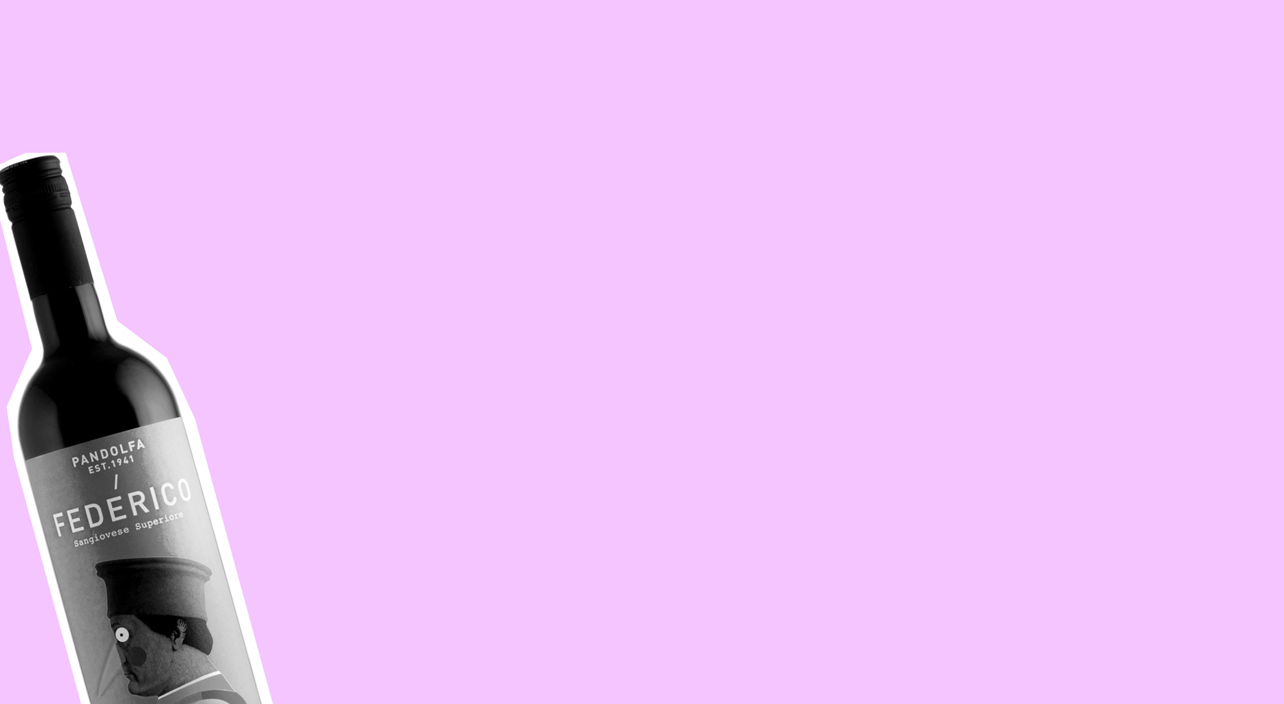
I love the quirkiness of these Renaissance-inspired illustrations on the Pandolfa labels, they’re just really fun and unexpected / The Silent Wanderer one is just pretty, but I think the subdued use of colour keeps it from being too sappy / The naive style of illustration on the Kindeli labels is charming and whimsical with the weird twist of half-human-half-fox characters with boobs stopping them from becoming too cute. It definitely sets you up to expect something a bit different from the norm.
I had to include all of these Fowles labels, because they’re enjoyable on their own, but they’re even more enjoyable when you realise there’s more than one of them. What can I say, the combination of serious-faced creature portraits and botanical art just gets me. I might just be a bit too drawn to whimsy. These feel like they would be perfect if you were having a nice dinner party and told everyone to dress up, but also you’re playing indie folk music in the background and you will probably end up discussing why Buffy the Vampire Slayer was your favourite TV show in the 90s/00s.
I also couldn’t go past including the range of Round Theory wines. Designed by Auckland studio, One Design, and illustrated by Gee Hale, these labels are playful, energetic, and beautiful. Because of the labels, even though these wines lack the tall slender bottles we’re accustomed to (for sustainabily reasons), they still maintain a feeling of elegance. They feel fresh and summery.
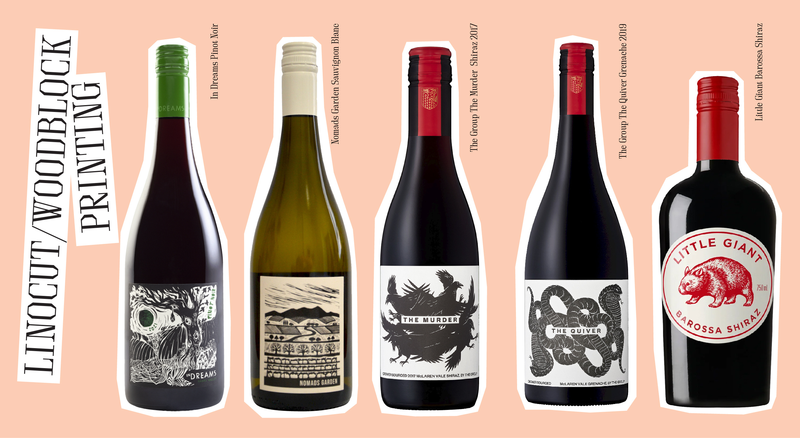
Linocut/Woodblock Printing
OK, I don’t know if these illustrations are actually lino or woodcuts or not, but that have that kind of vibe to them, which gives them a very bold, strong look.
I love how raw the In Dreams label is, the illustration is just a little bit chaotic and looks like it was created as an illustration first rather than a wine label which just feels a bit avant garde / The rest of these labels feel a bit more formal, the style of illustration brings a sense of understated elegance to the label. I am also amused by the low level menace from the The Group labels.
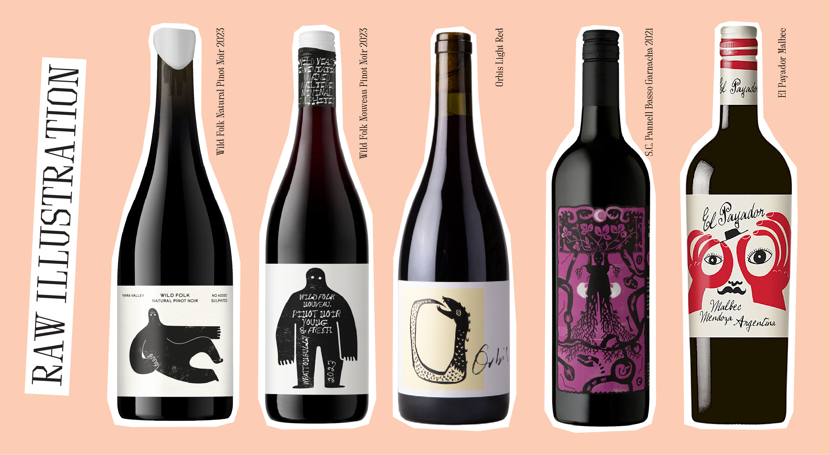
Raw Illustrations
This category has a lot in common with the previous one, being very monochrome, but there’s a lot more looseness in these illustrations. They’re a little bit wild and overall, quite quirky.
Love these Wild Folk labels – their monochrome simplicity still holds up as a serious wine label, but this yeti-style character feels quite fun. Serious, but not too serious. I also love the touch of hand lettering on the neck / I like how this Orbis label takes a really raw illustration but again maintains a sense of formality with the framing and the way it’s placed on the white label / This SC Pannell looks like wine to drink on Halloween / The playful illustration on the El Payador makes this a very festive looking beverage.
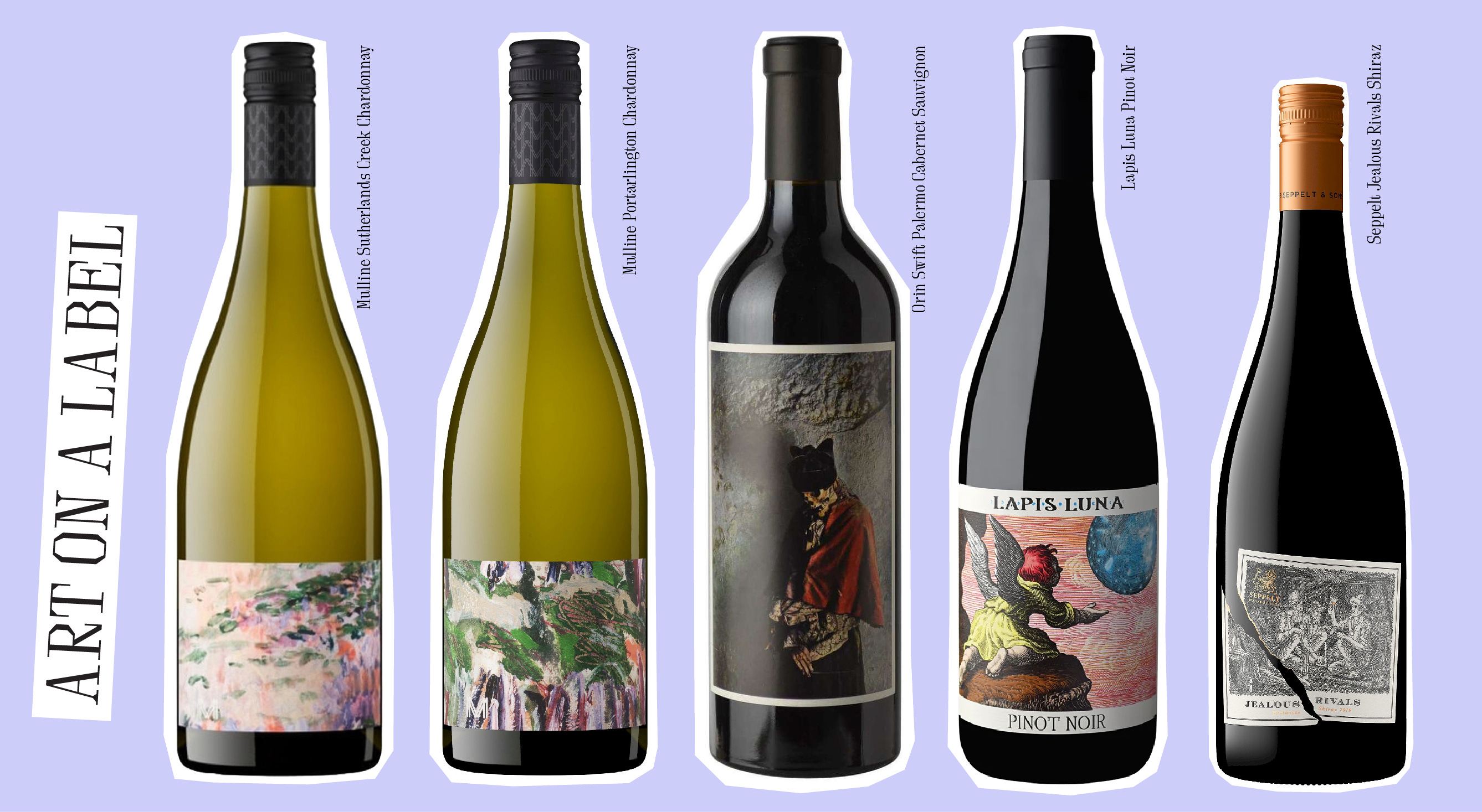
Art
These labels utilise more traditional art styles and in some instances have decided to let the art speak for itself.
These two Mulline labels feature an oil painting by artist Amy Wright, and these crops are just so beautiful why put anything else on the label (OK I did notice just now there is a very subtle logo in the corner). They’re very elegant but not stuffy / What is the story behind this pirate skeleton? I’ve no idea, but it’s the kind of weird that I like / The illustration and typography of the Jealous Rivals label isn’t particularly interesting, which I’m pretty sure is the point because it allows the clever concept to stand out – I love the way the label design and the name are working together in this way.
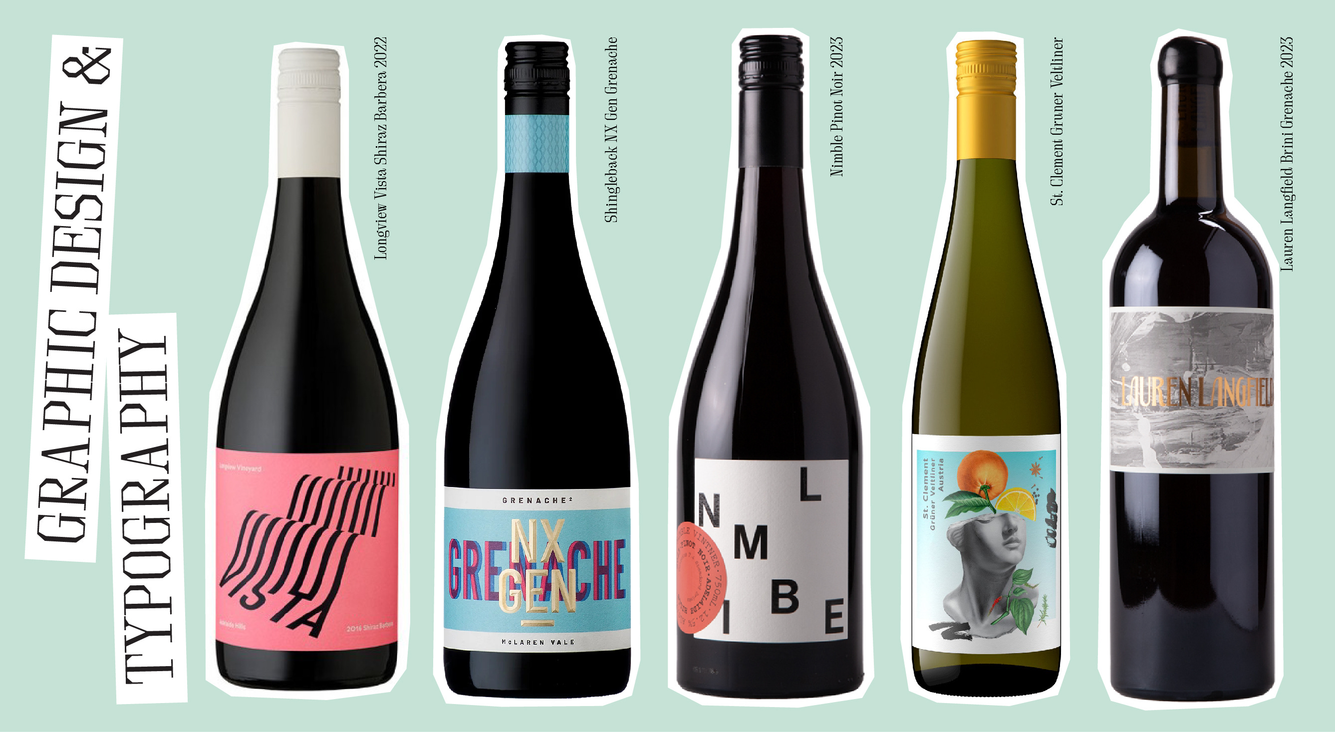
Graphic Design
This last category features some of my favourite designs that really are showcasing just that: good old fashioned graphic design.
I love the typographic execution of this Longview Vista label – the way the name of the wine is transformed into a really striking pattern. It just feels very clean and modern / I’m enjoying the slight trippiness of the deliberately mis-registered type on this Shingleback label. It feels a little bit edgy, but then it has that blingy gold-foil type over the top so it’s both flashy and edgy… maybe you’d bring this to an extrovert’s birthday or like, I dunno, drink it to celebrate making a bunch of money on the stock market or something flashy like that/ The typography on this Nimble label is so playful and fun and I love that they’re confident enough not to worry to much about how legible their name is / Yes, this St. Clement label has illustration on it, but I’ve included it here in graphic design because it feels more like a design composition to me, the collage style and the way the composition sits perfectly in the label feels like it was a very specific execution. I really like the juxtaposition of the classical statue and the citrus fruits, feels like a classy drop for summer / Love the super elegant Art Nouveau inspired gold foil type on this Lauren Langfield label. Like I said, I know nothing about wine, but label-wise, this one is the fanciest of my entire selection. It would look gorgeous on the table at a very elegant wedding or something.
So there you have it, my first ever wine label edit. I’m sure this is something I can do in the future as well, there are so many beautiful designs out there. Now if only someone could tell me a way of saving these labels after I’ve finished drinking my wine!
Thanks for reading AESTHETICISM! If you like very sporadic posts with way too many images in them, subscribe for free to receive new posts and support my work.